Dashboards (complete documentation)
Contents
Introduction
Dashboard types
Basics
General widgets
Specific widgets
Roles and permissions
How to use the feature
Global filters and On-Click charts
Corner situations
Introduction
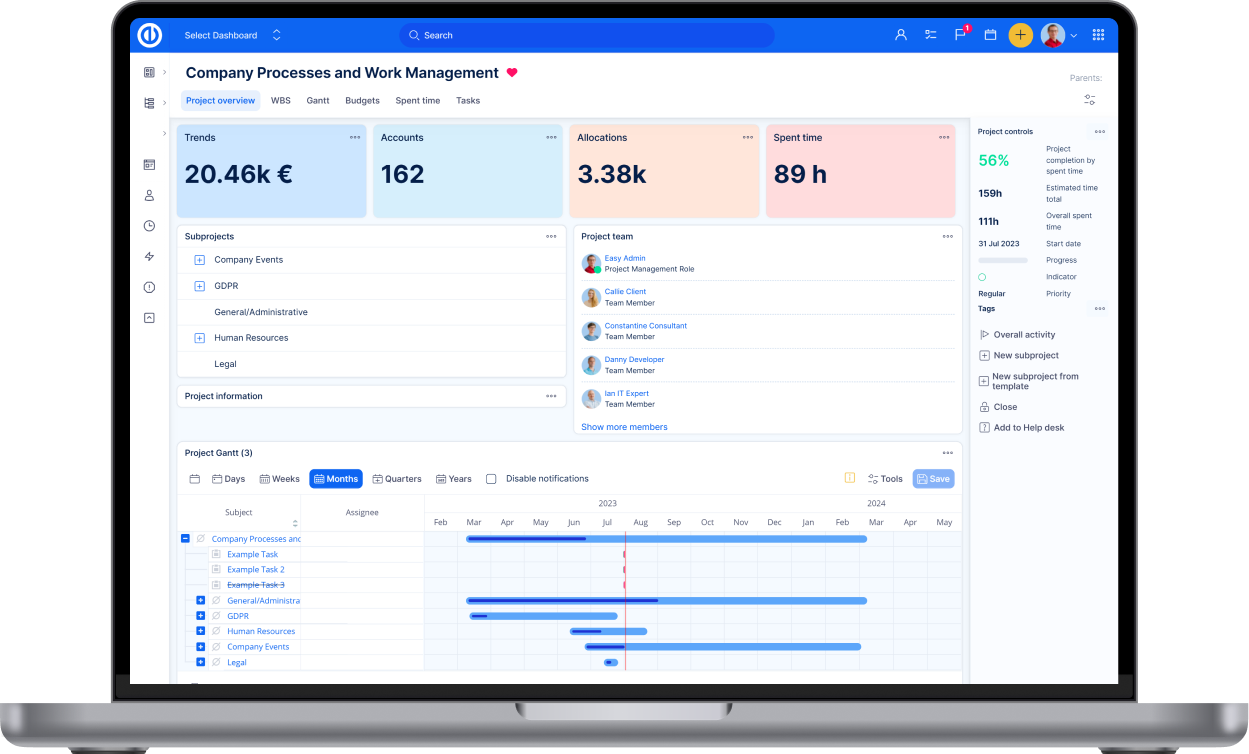
Dashboards ensure that relevant information is always at your fingertips. This feature enhances productivity by allowing managers, team leaders and workers themselves to quickly access, monitor, and analyze key metrics and progress indicators for their roles and responsibilities.
Dashboards types
There are 4 types of dashboards:
- My dashboard - the "homepage" page of every user
- Project dashboard - the first item in the menu when you access a project
- Feature dashboards - these are tied to a specific area (feature) of the application, such as time tracking, budgets, risk management, and many others. They are mostly accessibly through the global menu (top right corner)
- Custom dashboards - for whatever important agenda of your company, which is not covered by the options above
My dashboard
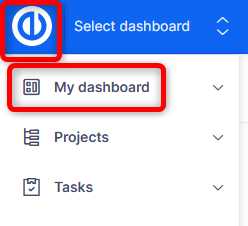
You are directed to it when you log in the application. You can access it by clicking on the Logo, or the first item in the left menu.
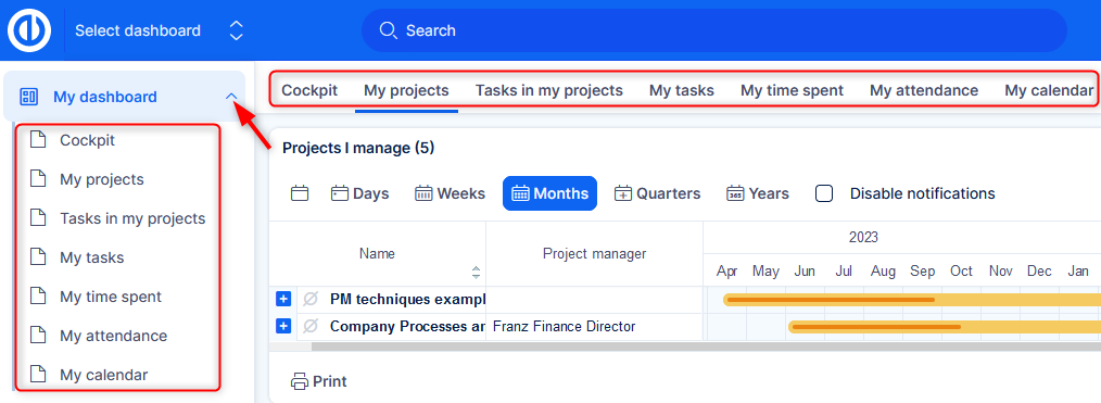
If you have more tabs your dashboard, they are available as submenu.
Project dashboard
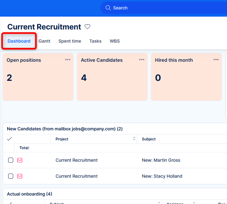
When you are in the context of a project, you will see a menu under the project name, where the first item is the project dashboard.
Feature dashboard
Various functional areas of the application have their own native dashboard, which acts as an entry point to that area. They can be access via global menu (in the top right corner) by clicking on a feature. Not all features are suitable for their own dashboard, though.
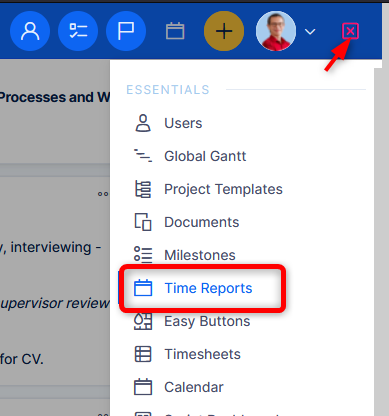
The list of areas that have a feature dashboard can be found in Administration >> Dashboard customisation >> Feature dashboards.
There are the feature dashboards for:
Essentials plan
- Time reports
- Milestones
- Legacy Scrum
- Scrum borads
Business plan
- Resource management
- Attendance
- Budgets
- Payroll and invoicing sheets
- Risk management
- Test cases
Platform plan
- Help desk
- CRM dashboard
- Accounts
- Opportunities
- Personal contacts
- Partners
- Contracts
- Leads
- Campaigns
- Price books
Add-ons
- Git integration
- AI (early adopters)
Custom dashboards
Here you are free to create your own context. The uses cases vary as much as the agenda of your company - Key company metrics, project portfolio management, financial controlling, information security management, incident monitoring, quality assurance, HR processes, etc. etc. etc.
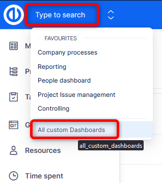
Management of custom dashboards can be accessed from Jump to dashboard in the top left corner >> All custom dashboards.
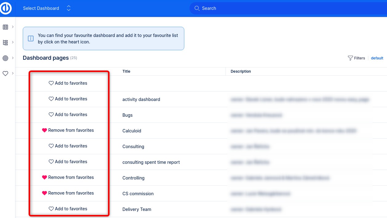
By "hearting" a dashboard, it will appear prominently in your Jump to dashboard selection in the top bar, so you can reach easily any time.
The basics
Let's look at the basic administration logic behind dashboards.
Creating a new dashboard
You have the option to build a dashboard from scratch by clicking the New Dashboard button in Administration >> Dashboard customisations.
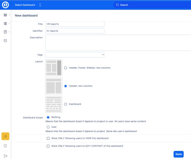
Page properties
- Title — name of the page.
- Identifier — will be used as the URL (link) to the page.
- Layout — Once you create this page, it is not possible to change the layout.
- Page scope — leave it at Nothing. The other option may be used in a custom implementation, but fornow, it is not relevant. Once you create this page, it is not possible to change the page scope.
In the example on the screenshot the URL
would be https://is.easysoftware.com/easy_pages/hr-reports. This is the form of link for every custom
dashboard.
These dashboards can be accessed by the Select dashboard feature in the top left corner.
It is natural that at the moment of the initial application set up you can't have a clear concept of what
kind of dashboards and report types you are going to use.
This setting may start after a few weeks of
production use. Don't spend too much time building dashboards with theoretical reports before you have
enough data in the system.
Functional buttons on widgets
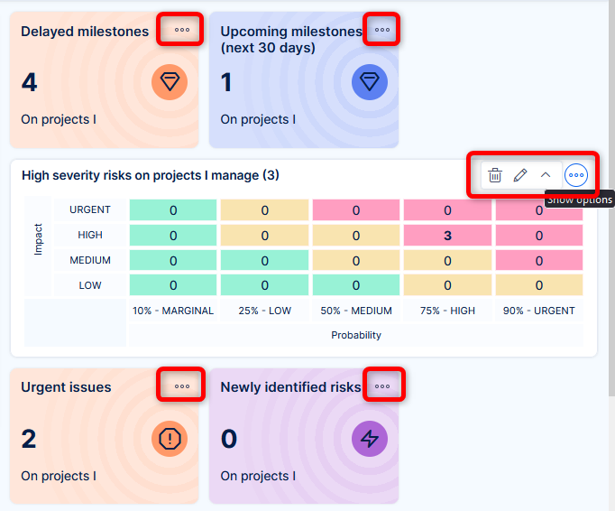
If you are administrator or have proper permissions, you will find three dots at the top right corner of every widget. By hovering mouse over it, options for the widet will appear. Every one has edit and delete buttons. Others may have specific buttons (collapse/expand, chart baselines).
This gives you a quick ability to make smaller changes.
Editing the whole dashboard
To make structural changes, click Customise at the bottom left corner of the dashboard.
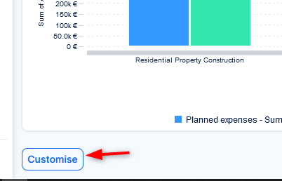
This will take you to the editation mode of the dashboard. You can add, edit, move, copy and delete widgets and tabs. This mode also allows to create a template from this dashboard, or to apply a template to this dashboard.
If the dashboard contains many widgets, the edit mode may take a little longer to load, since most of the widgets have vast configuration options.
Dashboard templates
For the sake of saving configuration time and/or standardization, most dashboards make use of templates. Templates are available for My dashboard, Project dashboards and Feature dashboards.
What (and why) it is
The logic behind My and Project dashboards is to easily manage unified contents for users/projects of a common type.
For example, all service desk operators are using one My dashboard template, without the permission to edit its contents. The service manager can be sure that they all see what they need to see in their "personal space". Then, whenever an adjustment is needed, it will be made in the template, and this template will then by applied to all users in the group service desk operators.
An example in projects, say there are projects belonging under the portfolio (main project) of Product development. They all adhere to the same execution principles, which are reflected in a common configuration of each of their dashboard. Whenever you make a change, just edit the template for product development projects, and apply to all projects belonging to this portfolio.
How it works
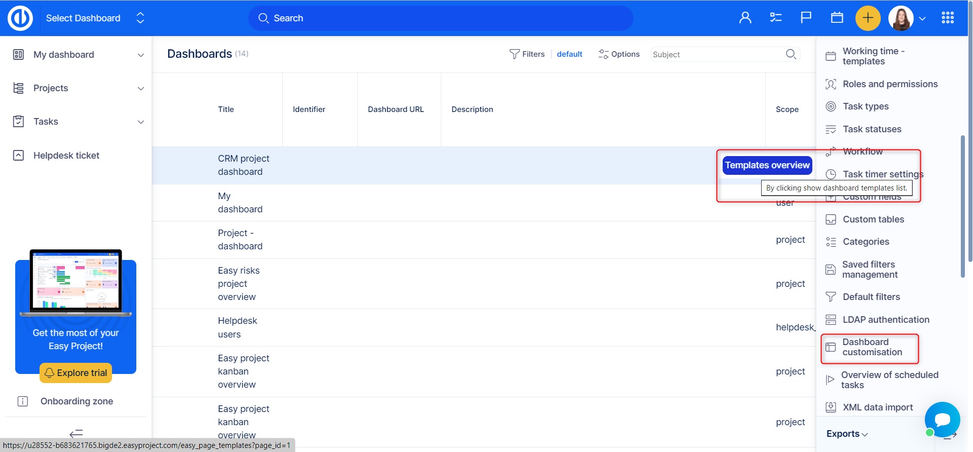
Dashboard templates are found in Administration >> Dashboard customisation. Hover the mouse over a type of dashboard to find the button to access all of its templates.
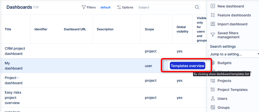
The template which is set as default is automatically preset for new users (unless you choose to change it during user creation), or projects (unless they are created from a project template).
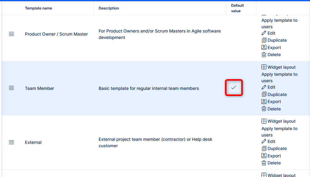
Then you will find control buttons.
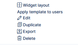
By clicking Widget layout you will access the preview and option to edit the template. Contents of some of the widgets can't be shown in the template, and make only sense when they are applied to the specific user/project after they are applied. Please remember that editing a template itself does not automatically take effect. You have to apply it.
Just aware that applying the dashboard by replacing their previous one, users/projects will lose all of configuration that was made directly on their dashboard. This is not a problem, if the users are not allowed to edit their dashboard. The less invading option is to apply the template by adding tabs. It makes sense when you want to add some new dimension to the dashboard. But of course, it is not sustainable for regular dashboard adjustments, unless you set a process for deletion of obsolete tabs.
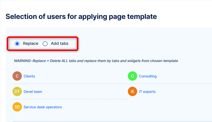
Dashboards can be imported and exported. A catalogue of dashboard templates for your immediate use or just inspiration is currently being prepared.
Widgets - general
There are overall almost 80 types of widgets you can put on dashboards. Vast majority are available for every dashboard types, others are only suitable for some types. We have universal widgets - usable for any entity type, and others more specialized widgets.
Here is a breakdown:
Universal
On every dashoard type, multi-entity.
- List
- Pivot table
- Trends
- Bar chart
- Line chart
- Pie chart
- Time series
- Generic gauge
- Dynamic filters (fewer supported entities)
All dashboards
- Activity feed
- Calendar
- Iframe
- Noticeboard
- Multilanguage noticeboard
- Tags
- Knowledge article (with Knowledge base add-on)
- Custom kanban
- Project kanban
- Project scrum board
- Sprint overview
- Earned value
- Global Gantt
- Group utilization (with the Business plan)
- Top user utilization (with the Business plan)
- Total allocation chart (with the Business plan)
- Task type allocations (with the Business plan)
- User utilization (with the Business plan)
- Asset and configuration management - List (Add-on needed)
- New task
- New account (with the Platform plan)
- New CRM (with the Platform plan)
- Organizational chart
- Personal resource management (with the Business plan)
- Resource management (with the Business plan)
- Resource report (with the Business plan)
- Agile resource management (with the Business plan)
- personal
- project
- team
- Risk matrix (with the Business plan)
- Who's doing what
Dashboard specific
- My dashboard
- Attendance (with the Business plan)
- Alerts - reports (with the Business plan)
- News
- Saved filters list
- My calendar
- My locked documents (with DMS add-on)
- My open approvals (with DMS add-on)
- My watched documents (with DMS add-on)
- Spent time
- Spent time calendar
- Project dashboard
- News
- Google maps
- Project description
- Project Gantt
- Project history
- Project information
- Subprojects
- Project card
- Project tree
- Project team
- Project team from filter
- Project accounts (with the Platform plan)
- New opportunity button (with the Platform plan)
- Custom dashboards
- Attendance (with the Business plan)
- Attendance report (with the Business plan)
- Project team from filter
- Spent time
- Spent time calendar
- Attendance dashboard (with the Business plan)
- Attendance
- Attendance report
- Spent time
- Spent time calendar
- Help desk (with the Platform plan)
- Create e-mail template button
- Create mailbox button
- Help desk e-mail templates
- Help desk mailboxes
- Help desk projects from filter
- CRM (with the Platform plan)
- Custom pie chart
- Member performance
- User targets
- CRM - Leads (with the Platform plan)
- Attendance
- Attendance report
- Project team from filter
- Spent time
- Spent time calendar
- CRM - Opportunities (with the Platform plan)
- Attendance
- Attendance report
- Project team from filter
- Spent time
- Spent time calendar
- CRM - Accounts (with the Platform plan)
- Accounts group button
- Favorite accounts button
- New account button
- CRM - Personal contacts (with the Platform plan)
- Attendance
- Attendance report
- Project team from filter
- Spent time
- Spent time calendar
- CRM - Partners (with the Platform plan)
- Attendance
- Attendance report
- Project team from filter
- Spent time
- Spent time calendar
- CRM - Campaigns (with the Platform plan)
- Attendance
- Attendance report
- Project team from filter
- Spent time
- Spent time calendar
- CRM - Contracts (with the Platform plan)
- Attendance
- Attendance report
- Project team from filter
- Spent time
- Spent time calendar
- CRM - Price books (with the Platform plan)
- All records
- CRM records
- Invoice records
Specific widgets
Time to take a closer look at a selection of the high profile widgets.
Noticeboard
Just a simple ad-hoc text area with basic HTML formatting. A typical use case is description of your hiring process on your HR dashboard...on that note, any process description on any process dashboard.
List
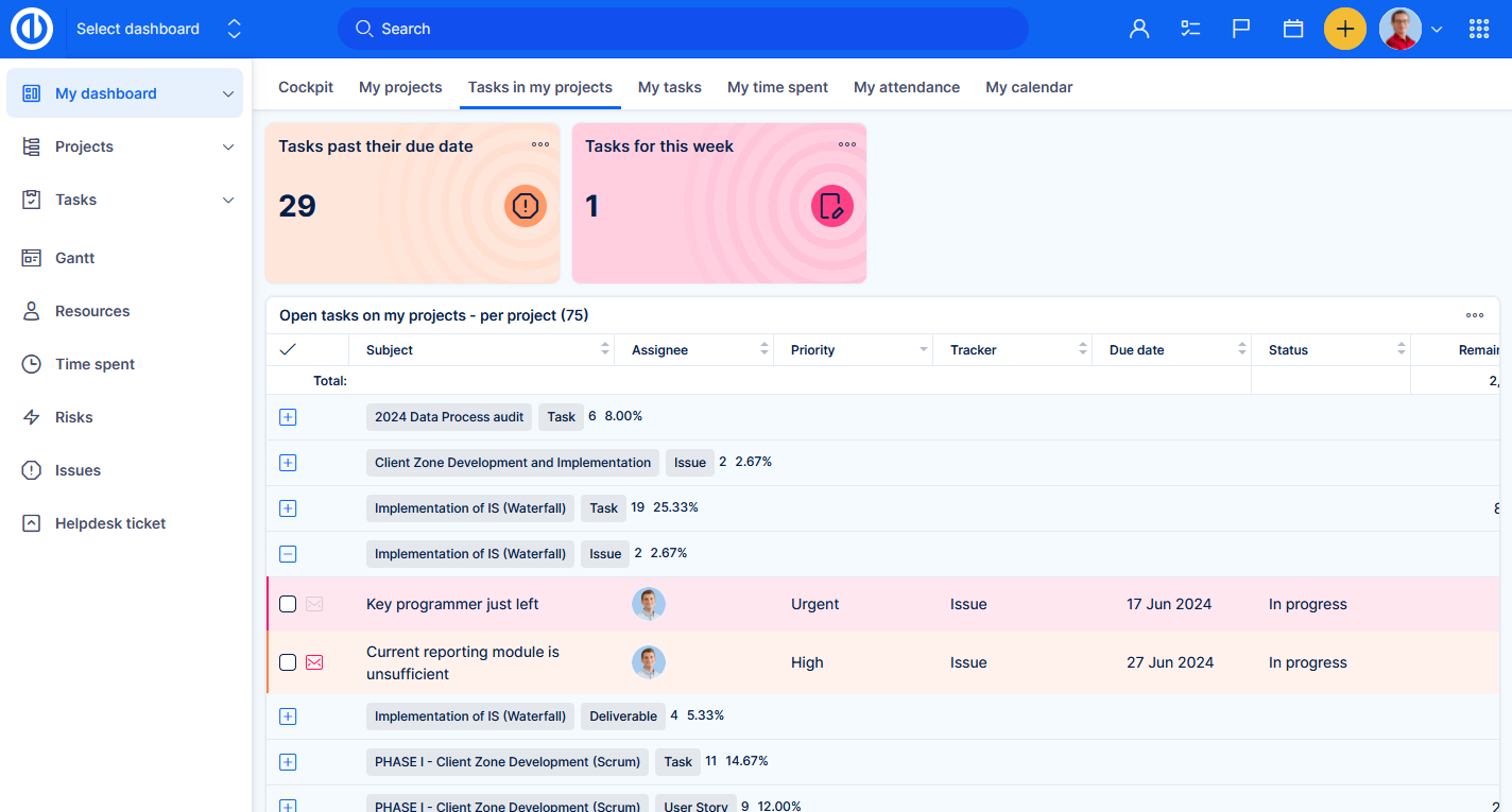
This widget represents a table view above any entity type (tasks, spent time, milestones, etc.). It is the most commonly usable widget, although it has challenging substitutes described below. After all, a dashboard comprised of just lists is not really a dashboard.
We recomment 1-2 lists on a dashboard. It should contain only items that, for any reason, must to be visible to every user visiting the dashboard. For example, TOP priority tasks can be listed on a dashboard of each project, any visitor should see them on the first sight to get a quick idea of the current situation.
How to set
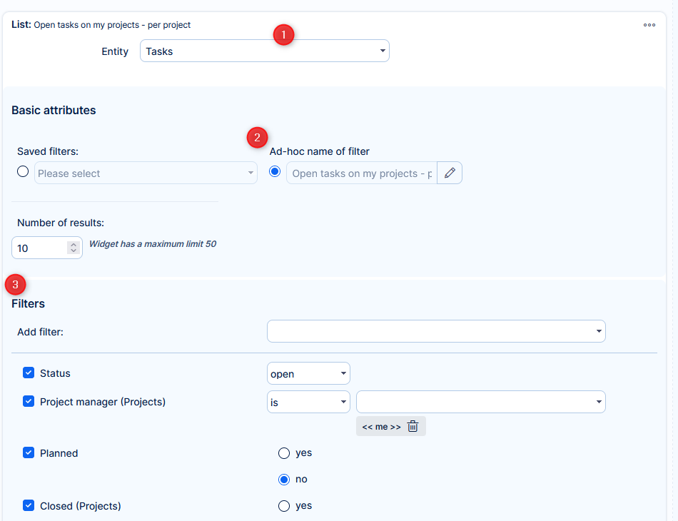
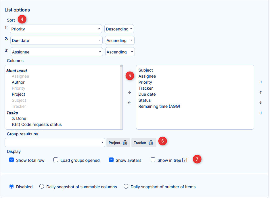
- Select entity type.
- Select an already saved filter, or create an ad-hoc filter (with a name) for this particular widget.
- If you are creating an ad-hoc filter - here you will define which items (based on their attributes) will be shown.
- Set up to three sorting criteria.
- Don't overdo it with the number of shown columns. For example, if it is clear from the name of the filter (widget) that you are only showing TOP priority tasks, you need not show column Priority.
Also, keep in mind that user can open the task in quick task editor, where they will find other attributes, that may not be really neccessary in the list. - Grouping is a good idea when the list would show too many items. It is possible to group items by more attributes. One group would represent every unique combination of the grouping attributes.
- Additional options for the list - Total row is applicable to numeric (summable) columns. When grouping, we recommend leaving groups closed (collapsed) for the sake of quicker widget loading. Using avatars saves space when you have a column representing a users. Showing in tree is only useful when you have a full structure of parent-subtasks. If some parent task is missing because it does not respect the filter, this view becomes misleading.
Dynamic filters
Dynamic filters have their own documentation article. In the context of dashboards, this widget plays a briliant role. Let's say you have a dashboard for internal incident reports. It contains various statistics shown in charts, trends, pivot tables, etc. which is good for an overview. But what if you want to find a specific incident, or set of incident. Well, just add this widget, set the filter for task type - Incident, set sorting from the most recent - this would be the default state. From there you can narrow the filters down to help you locate your desired selection or a single incident. All happens instantly within the widget, without you having to leave the dashboard.
How to set
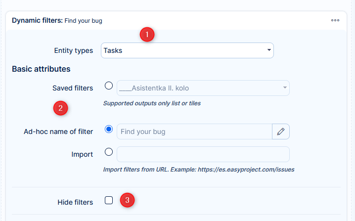
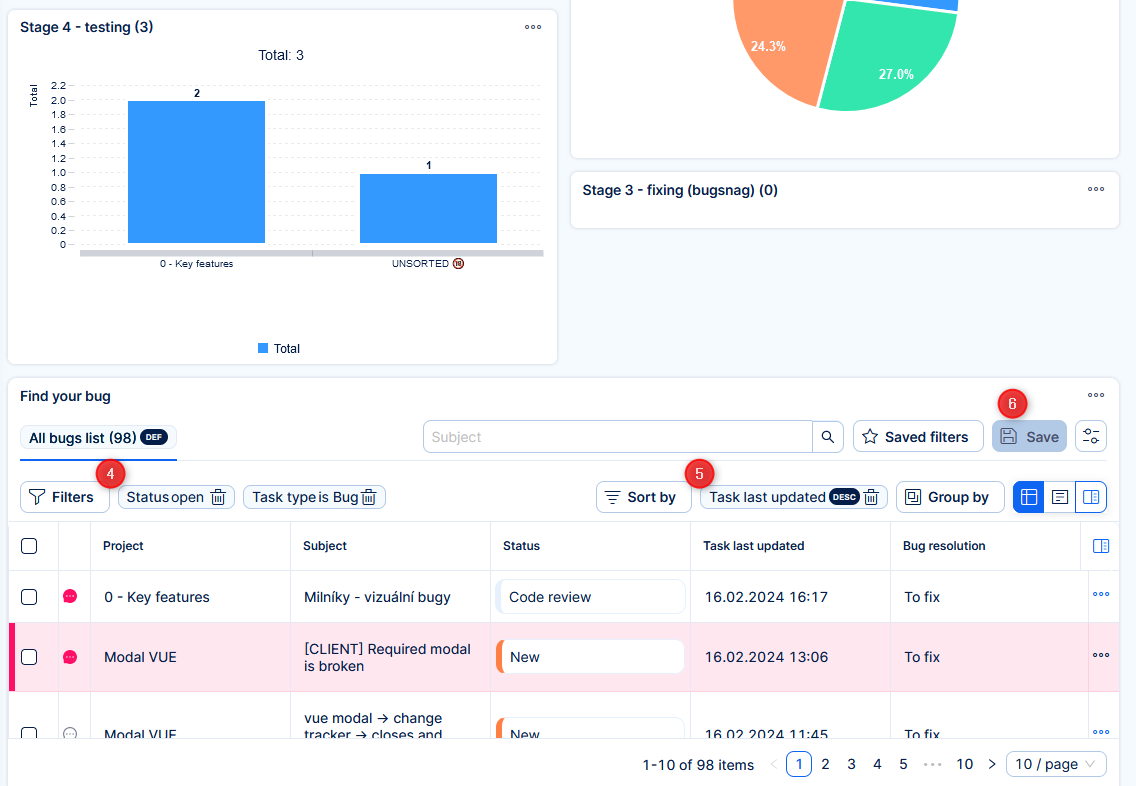
- Select entity type.
- Select an already saved filter, or create an ad-hoc filter (with a name) for this particular widget.
- In the use case described above, you do not want to hide the filters. In other cases, this option helps to prevent visual overwhelming.
Save the dashboard and continue configuration on the existing widget. - Set the necessary filters.
- Set sorting.
- Save this state of filters - this will be the default state for any user who visits the dashboard.
Any user can make independent ad-hoc changes in the widget to help find their task. Their changes in the widget are not saved, so it is ready in the default state for other visitors.
Trends
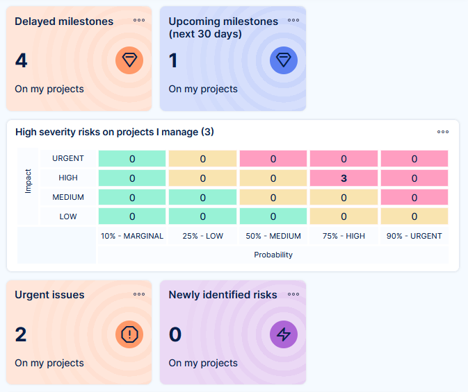
Here is the first widget that can graciously substitute a regular list, while saving a lot of space, yet still providing important information and access to the list beneath its data.
Trends work for any entity type. They can show the number of items respecting the filters (e. g. 4 milestones are delayed), or sum of values of a selected numeric attribute (Total estimated time of urgent tasks is 15 hours).
So why are they called Trends? If you use a time attribute for filtering (e. g. tickets closed in the past 30 days), the widget can show you the percentage differential compared to the previous period of 30 days before the current period.
By clicking on the widget, a pop-up will be opened with the items representing the data series within the trend. The columns shown in the list are based on the default filter settings.
How to set
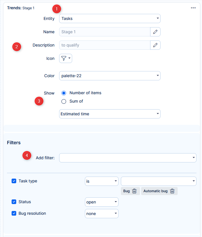
- Select entity type.
- Name (heading) is important; Description is not always necessary, should be kept shorter if needed; Icon may help visual distinction.
- Which total are you watching.
- Define which items (based on their attributes) will be counted.
Compare to previous period
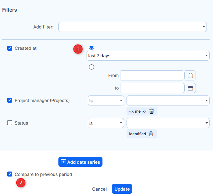
- Make sure a time attribute is selected in filters
- Tick the box
Secondary data series
But that's not all! Trends allow to compare two data sets and perform mathematical operations between them. For example average estimated time per task.
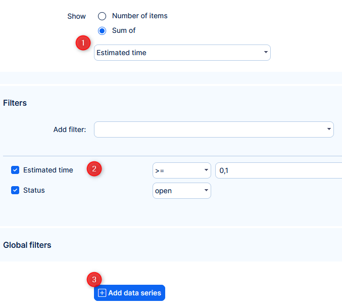
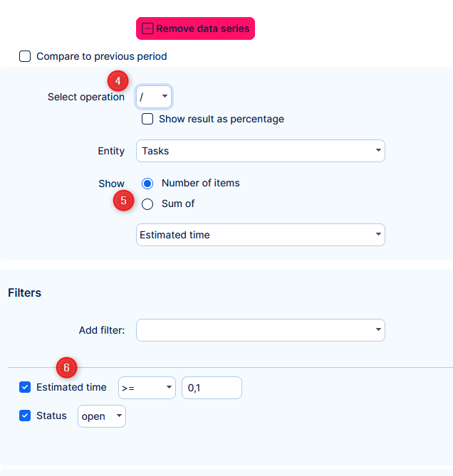
- Set trend to count the sum of estimated time
- Define which items (based on their attributes) will be counted.
- Add data series
- Select operator
- Set to count number of items (in our example)
- Define which items (based on their attributes) will be counted.
The basic mathematical operators are accompanies by "<", which will show the result of the first data series and percentual differential from the second series.
Charts
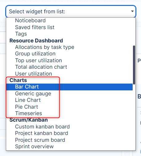
There are 5 basic types of charts: bar chart, generic gauge, line chart, pie chart, and timeseries. All of them might be added to any personalized dashboard. Just go to one and click the "Customise" button in the lower-left corner. Afterward, browse the list of widgets to add and select the appropriate type of chart right from there. In addition to those charts as independent widgets, there are also many other widgets (such as attendance, earned values, CRM cases, spent time, money, etc.) which also can be configured to show data using one of the selectable types of charts.
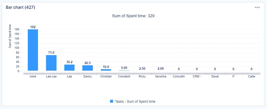
Bar chart
A bar chart is a chart that presents categorical data with rectangular bars with heights or lengths proportional to the values that they represent. The bars can be plotted vertically or horizontally. A bar graph shows comparisons among discrete categories. One axis of the chart shows the specific categories being compared, and the other axis represents a measured value.
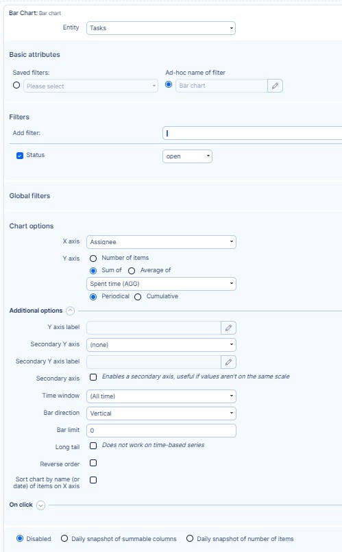
Setting options of Bar chart
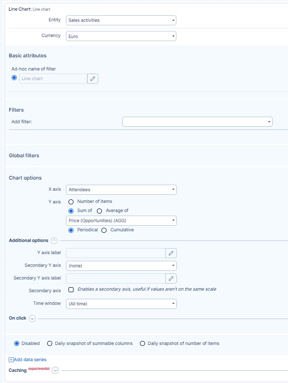
- Entity: Select the entity whose values you would like to see in the chart, such as Tasks, Users, CRM, etc. Also, give your chart a name.
- Filters: Optionally, select filters to reduce shown data to only specific values within the entity, such as "Assignee is me".
- Global filters: See - Custom dashboards and Global filters
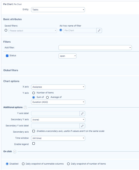
- Chart options: Define the data shown on the X axis and Y axis, including Additional options such as labels, time window, bar direction, bar limit, and order. After adding a secondary Y attribute, the user can choose whether the secondary Y axis should be shown, or whether only one Y axis will be used for both attributes.
- On click: See - Custom dashboards and Global filters
- Caching: Optionally, select for how many days will the widget be cached. Leave blank for defaults (1 day).
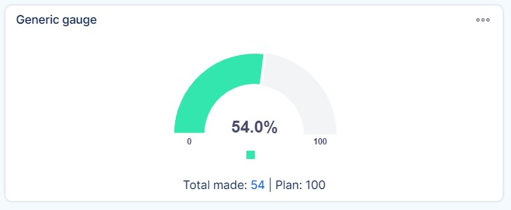
Generic gauge
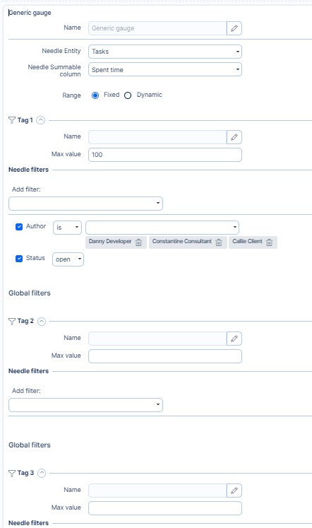
Generic gauge uses needles to show information as a reading on a dial. On a gauge chart, the value for each needle is read against the colored data range, which can be configured as fixed or dynamic. This chart type is often used in executive dashboard reports to show key business indicators. Generic gauge supports up to 3 tags in order to quickly change the chart settings, such as weekly, monthly, and quarterly performance, without the need to add more charts for this purpose. You can click on each tag and switch between results.
Setting options of Generic gauge
- Name: Give your gauge a name.
- Needle entity: Select the data source of the needle, such as CRM cases, tasks, spent time, etc.
- Needle summable column: Select the data category of the needle, such as price, spent time, remaning time, etc.
- Range: Select data range of the needle (fixed or dynamic). Fixed means that the range is given by the Max value you manually set. Dynamic means that the range is given by the selected range entity and range summable column. It will change anytime the value of the entity in "Range summable column" changes. For example sum of estimated time on open tasks.
- Tag #: Generic gauge may contain up to 3 tags, which basically means 3 different generic gauges in one widget with the possibility to quickly switch in between like tabs in your web browser. For each tag, you may enter a different name, needle filters and range filters, while other settings are common for all the tags.
Line chart
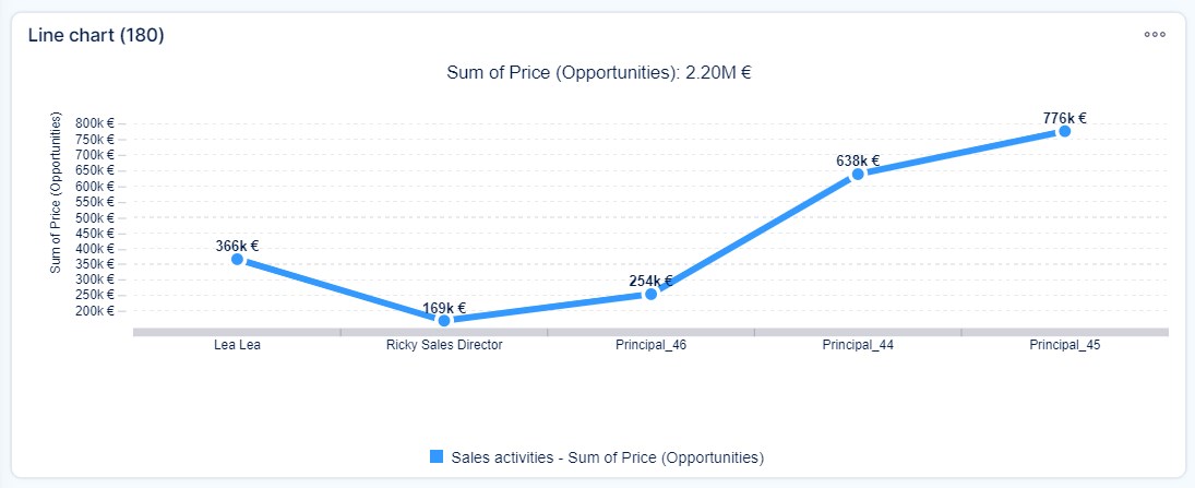
A line chart is a type of chart which displays information as a series of data points called 'markers' connected by straight line segments. It is a basic type of chart common in many fields. It is similar to a scatter plot except that the measurement points are ordered (typically by their x-axis value) and joined with straight line segments. A line chart is often used to visualize a trend in data over intervals of time – a time series – thus the line is often drawn chronologically. In these cases, they are known as run charts. If multiple lines are shown in one line chart and some values are missing for any line, the missing values will be replaced automatically with value 0 in order to keep the lines continuous.
Setting options of Line chart
Same as Bar chart.
Pie chart
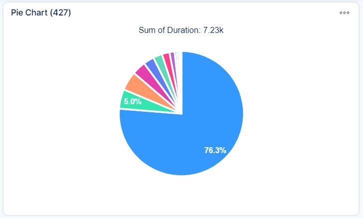
A pie chart is a circular statistical graphic which is divided into slices to illustrate numerical proportion. In a pie chart, the arc length of each slice (and consequently its central angle and area), is proportional to the quantity it represents. Pie charts are very widely used in the business world and the mass media.
Setting options of Pie chart
Same as Bar chart.
Timeseries
The best thing on timeseries is that you can view any number of various entities in one chart. For example, a total performance chart, containing the sum of story points on closed tasks, project incomes by date, number of closed support tickets, amount of billable service hours, the total value of billable service hours, etc. Just think of the possibilities.
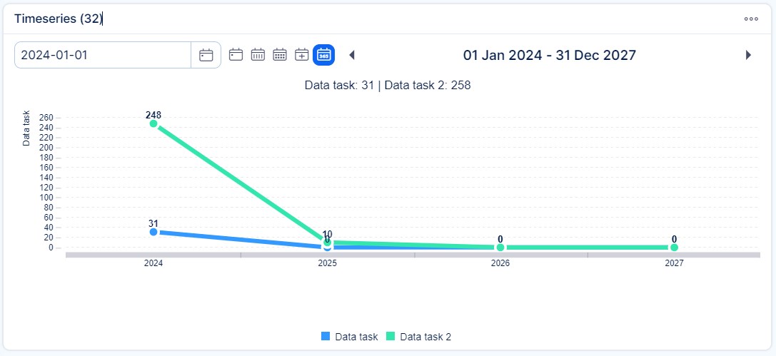
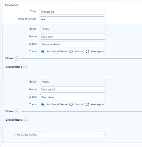
How to use:
- During dashboard customisation, find widget Timeseries
- Choose the default period
- Add data series
- Choose entity (the entity must have some date attribute (for example due date in tasks, contract date in CRM cases)
- Select which date attributed will be used
- Select which value will be on the chart. You can select the number of the entities but also sum or average of a numeric attribute of the entity.
- Set filters for the entity
Baseline on charts
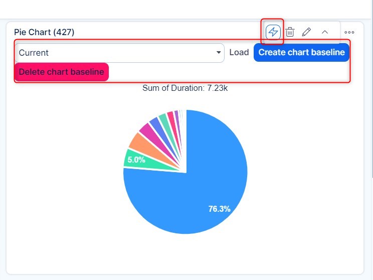
Baseline is a convenient chart-related feature for saving the continuous development (changes) on pie, bar or line charts. It is indicated by a lightning icon visible in all chart widgets added to any customisable dashboard. By clicking the icon, a drop-down list of existing baselines appears together with two buttons. To create a new baseline, click on the "Create baseline" button and refresh the page to make it appear in the list. To load an existing baseline, just select one from the list and click the "Load" button. To delete a baseline, click the Delete button next to the Create button.
Custom kanban
On your Dashboards, you can set up multiple kanban boards - we sometimes call this mode "multikanban". This kanban is designed to show any filter of tasks, in the kanban/board view. Each such view has its own settings (setting per module).
For more detailed description please go to the following link: Agile board- Scrum and Kanban
Spent time (gauge)
With generic gauge you are able to create a great tool to see how much spent time has been logged compared to plan.
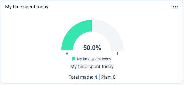
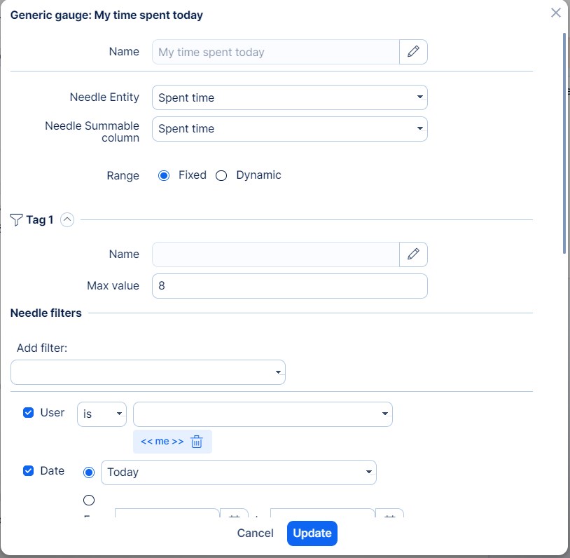
To set this widget for this purpose, select Generic gauge from the list and set Spent time as the needle entity. You will find two options to set the Max number of the gauge: Fixed and Dynamic.
Fixed option will let you enter a fixed number. For example a worker should log 8 hours of work everyday, so in this case the fixed number is 8. To see logged time for the current day, set filters the following way : User is <<me>>, Date is Today
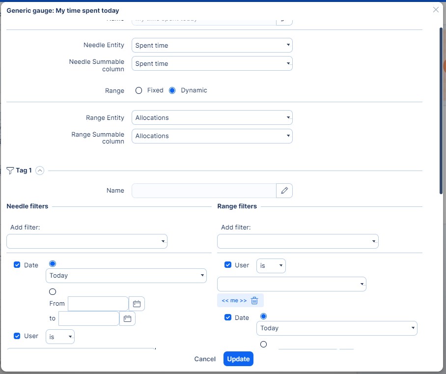
Dynamic options lets you automate this and also apply the plan according to users individual schedules.
The max number will in this case come from selected data. In our example, we selected Allocations, where we filter again : User is <<me>> and Date is today. The max number will change accoridng to allocations of the current user for the current day.
Attendance
This widget gives you an overview of attendane with the option to log attendance directly.
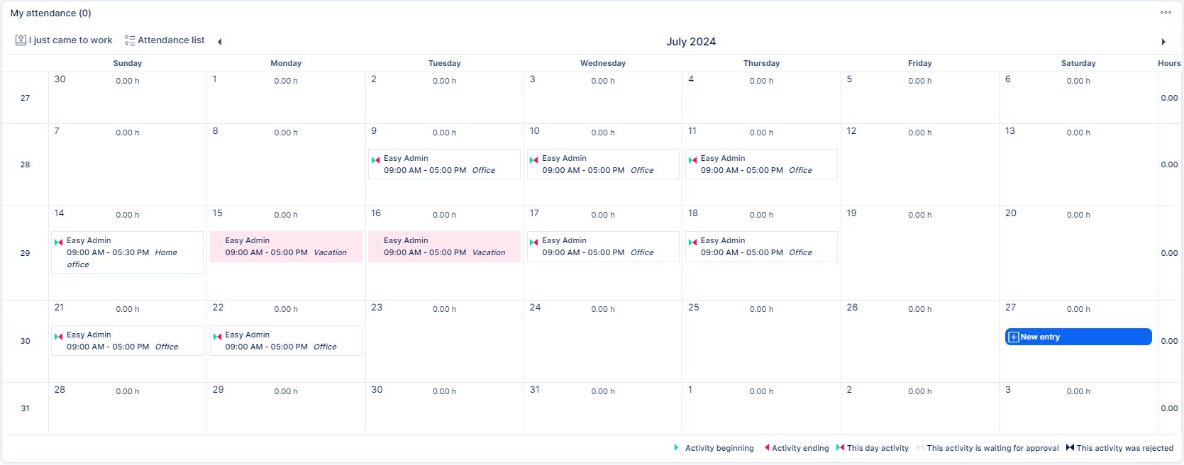
Attendance widget is by default set with a calendar view, but you are able to select ay of the following: list,tiles,chart,calendar,pivot table.
Calendar view has additional setting to have a weekly, or monthly view.
With the button " I just came to work" you will trigger a popo up, where you can select activity, user and time of start and end of the working day. In calendar view, each day will give you option to add " new entry" .
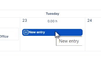
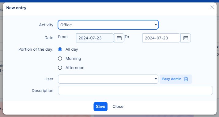
Options of logging attendance will be set according to your attendace settings. For more details please read the Attendance management documentation.
Project card
In the sidebar, you will find selection of "widgets for sidebar"
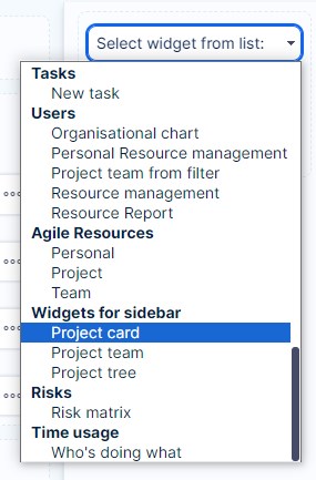
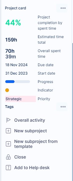
Project card will show project data in a simple overview, unlike project information, you will also have the following options available directly from it:
- Overall activity
- New subproject
- New subproject from template
- Close
- Add to Help desk
Project description
This widget will show the project description, which is usually only available when editing a project. This will enable users without permissiont to edit project to view it directly on the Project Dashboard.
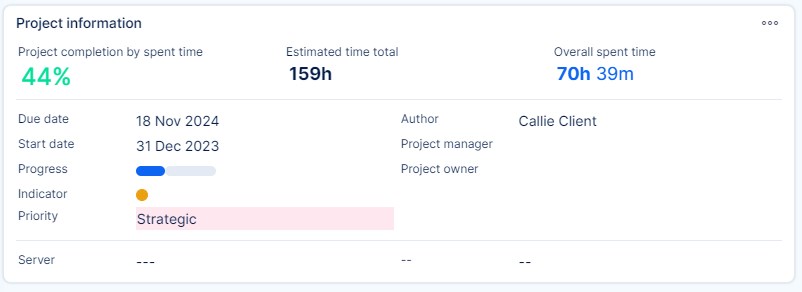
Project information
This widget is similiar to Project Card. But t will display core project information only.
New task
New task widget gives you the option to quickly create tasks directly from a Dashboard.
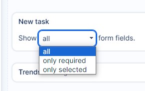
You will find 3 options to show fields when adding this widget:
Show all, only required or only selected:
If you choose the "only selected option" you will be able to directly select which fields will appear in this widget:
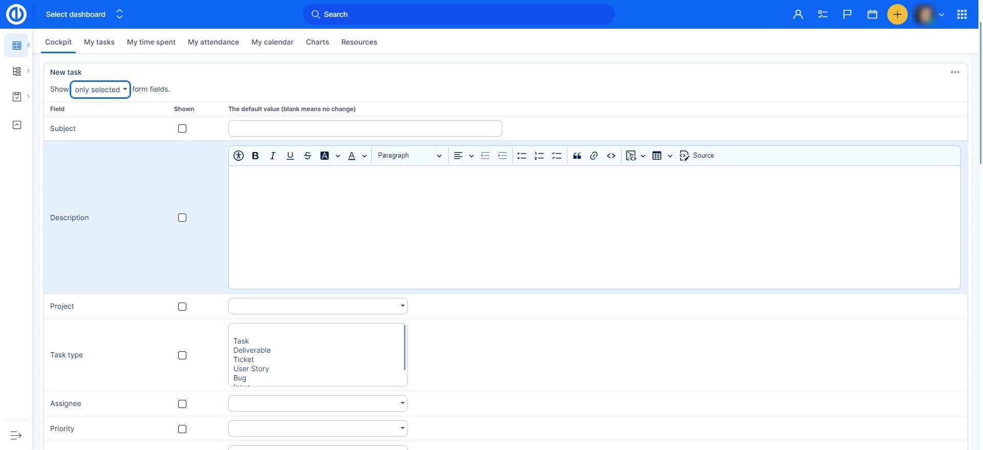
Be mindful while selecting the fields, as some fields are essential while creating a task ( subject, task type). Not including those can cause issues while creating tasks this way.
iFrame
In iFrame you will be able to use HTML element used to embed external content, such as videos, maps, or entire webpages, within your dashboard. While convenient, iFrame can impact performance and pose security risks if not implemented properly, so we advice being mindfull when using this type widget.
Roles and permissions
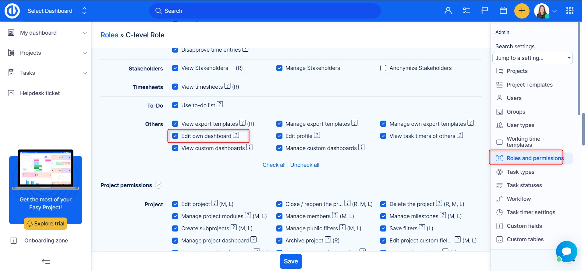
Only administrator and partial administrator for "Dashboard customisation" area are allowed manage the feature in terms of creating or editing dashboard templates and applying them to user accounts. This permission can be given to a user on his user account (see below).
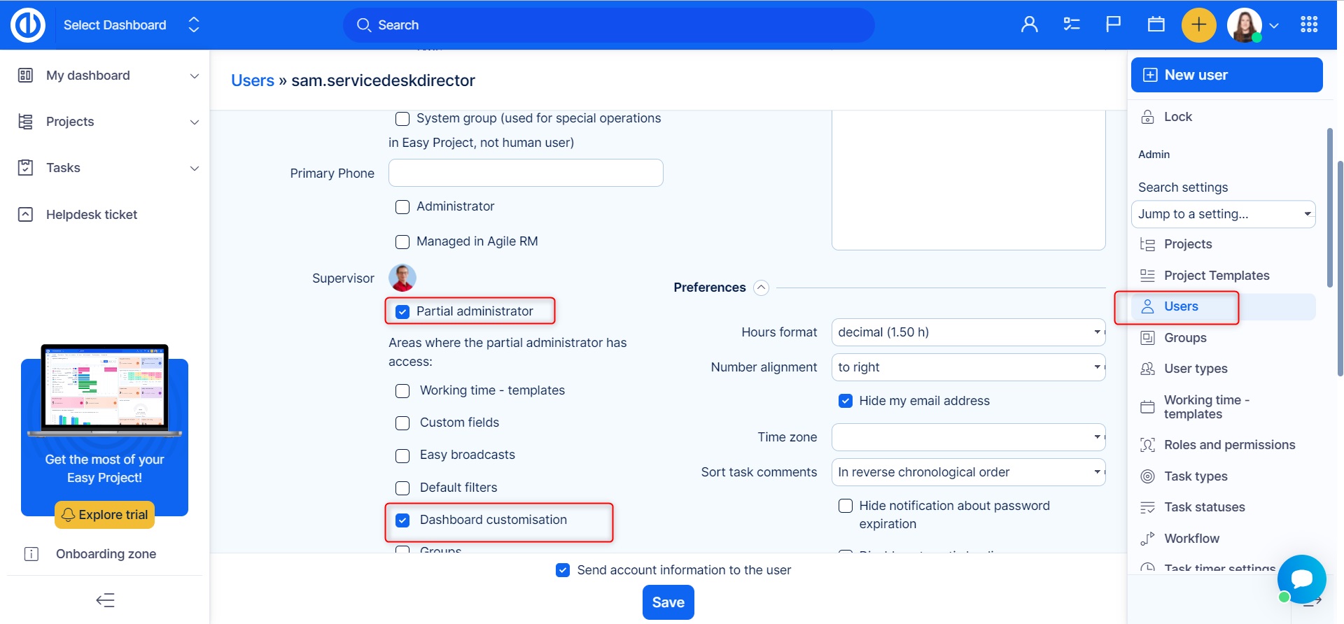
If a user is given the permission "Dashboard customisation", they can edit his homepage himself but it doesn't mean he can do so for other users.
How to use the feature
Go to More >> Administration >> Dashboard customization. On the main page, you see a list of templates for My dashboard (your personalized homepage), Project - homepage, and CRM project overview. To start working with templates, select one of these entities and click on the green button "Templates overview" on the left side.
You can have an unlimited number of dashboard templates for one entity as shown below. Each template can be recognized by its name and description. In our example, we used names according to various user roles, such as project manager, worker, client etc. You can also fill in a description for a template. To add a new template, just click on the particular green button in the upper right corner. As you see, each template has a few options on the right side of the list.
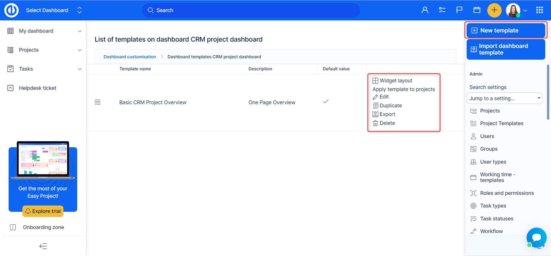
- Widget layout - Allows you to add/remove modules from the template, the process in the same as in the standard dashboard personalization/customization.
- Apply template to projects - Allows you to select particular project to apply the selected template to.
- Edit - Allows you to change the basic template's attributes such as template name, description, and default value.
- Duplicate - Allows you to create a copy of a template.
- Export - Allows you to export the template.
- Delete - Allows you to delete a template.
Alternative ways to apply a dashboard template
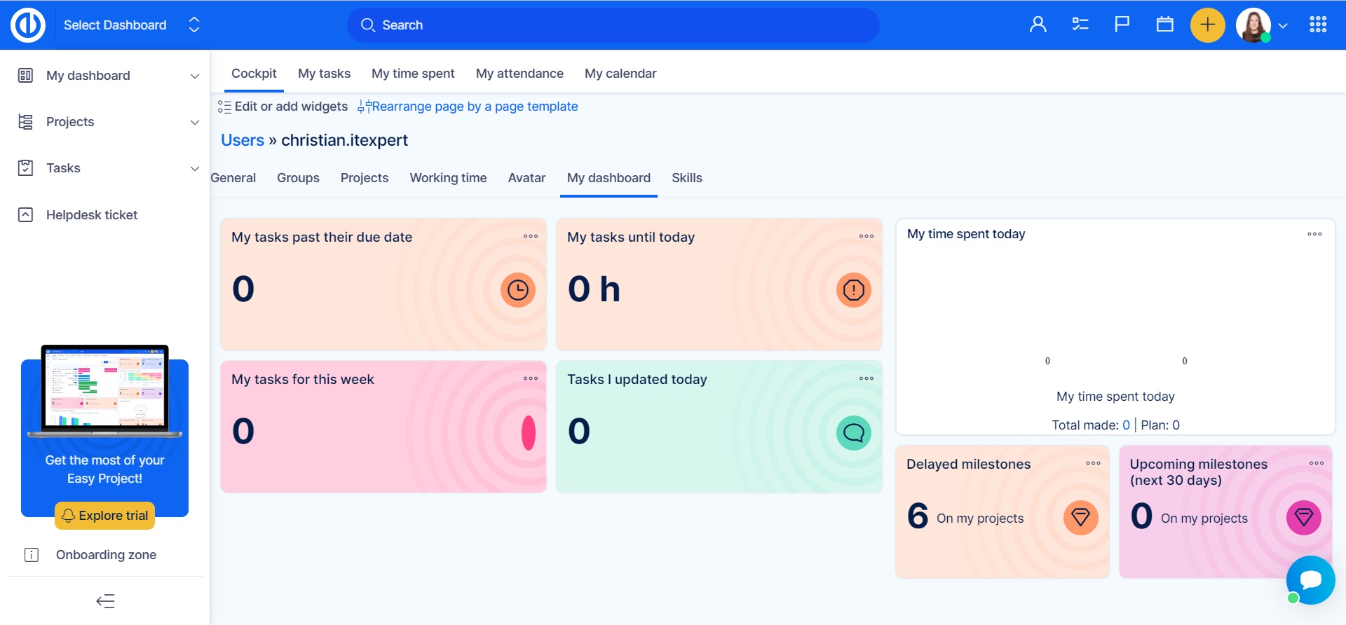
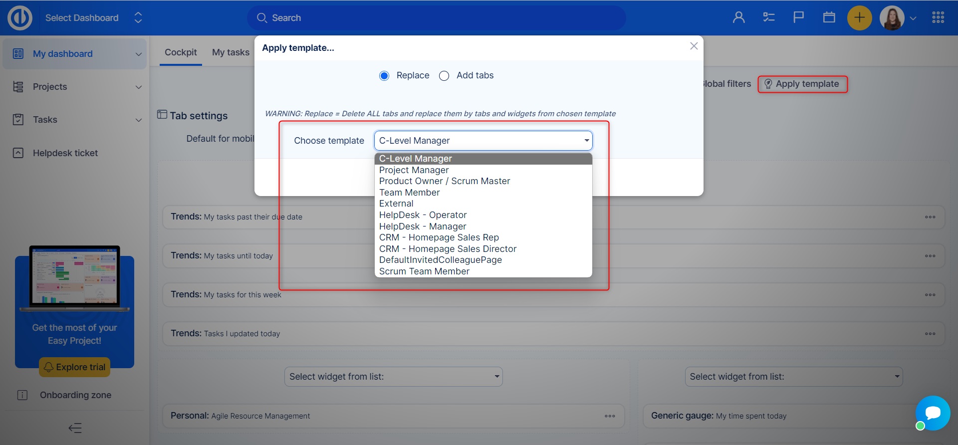
In addition to the standard procedure as described above, the template and can also be applied and/or updated directly from the particular user's account. Just open "My dashboard" tab, click on the red "Rearrange dashboard by a dashboard template" button, select the template and save (see below).
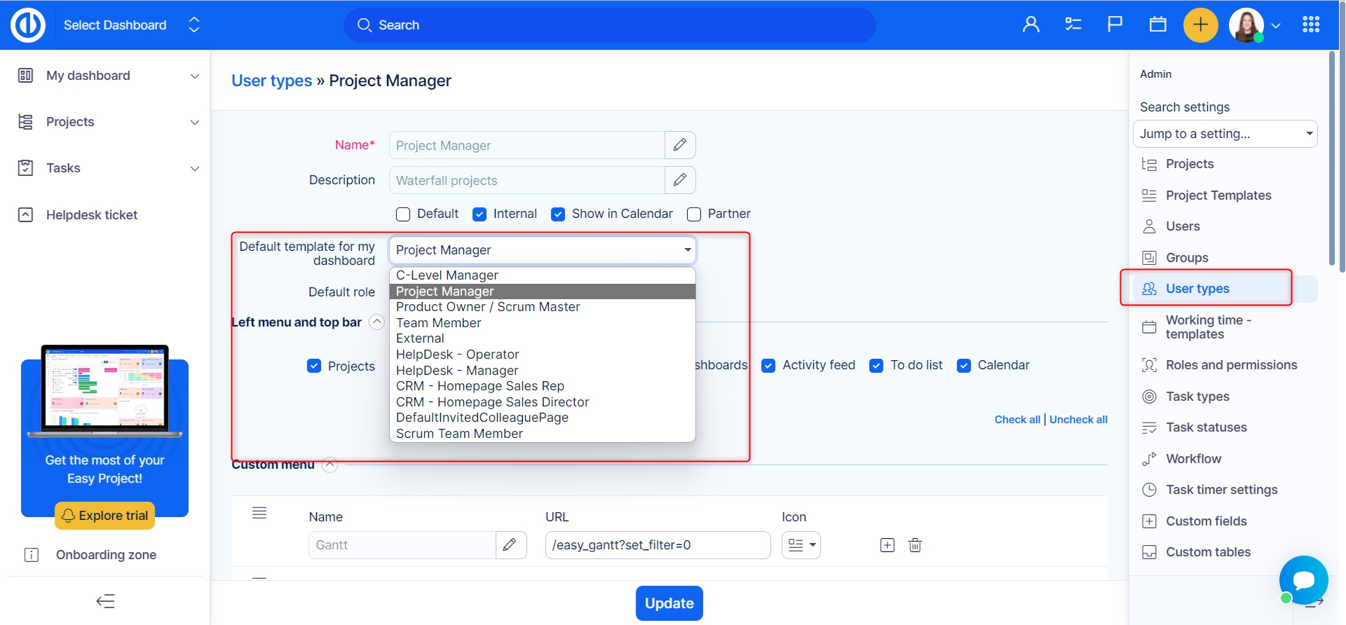
Moreover, in Global menu >> Administration >> User types - Default template for my dashboard, you can simply link a dashboard with a particular user type so each newly created user account of that user type will have this custom page predefined by default (see below).
Also, any user with the permission "Edit personal dashboard" can apply a dashboard template for himself by selecting one from the drop-page menu in the page personalization view. Moreover, having the partial admin rights at least, he can create a new template out of his current page configuration by clicking on the "Create template" button (see below).
Feature Dashboards
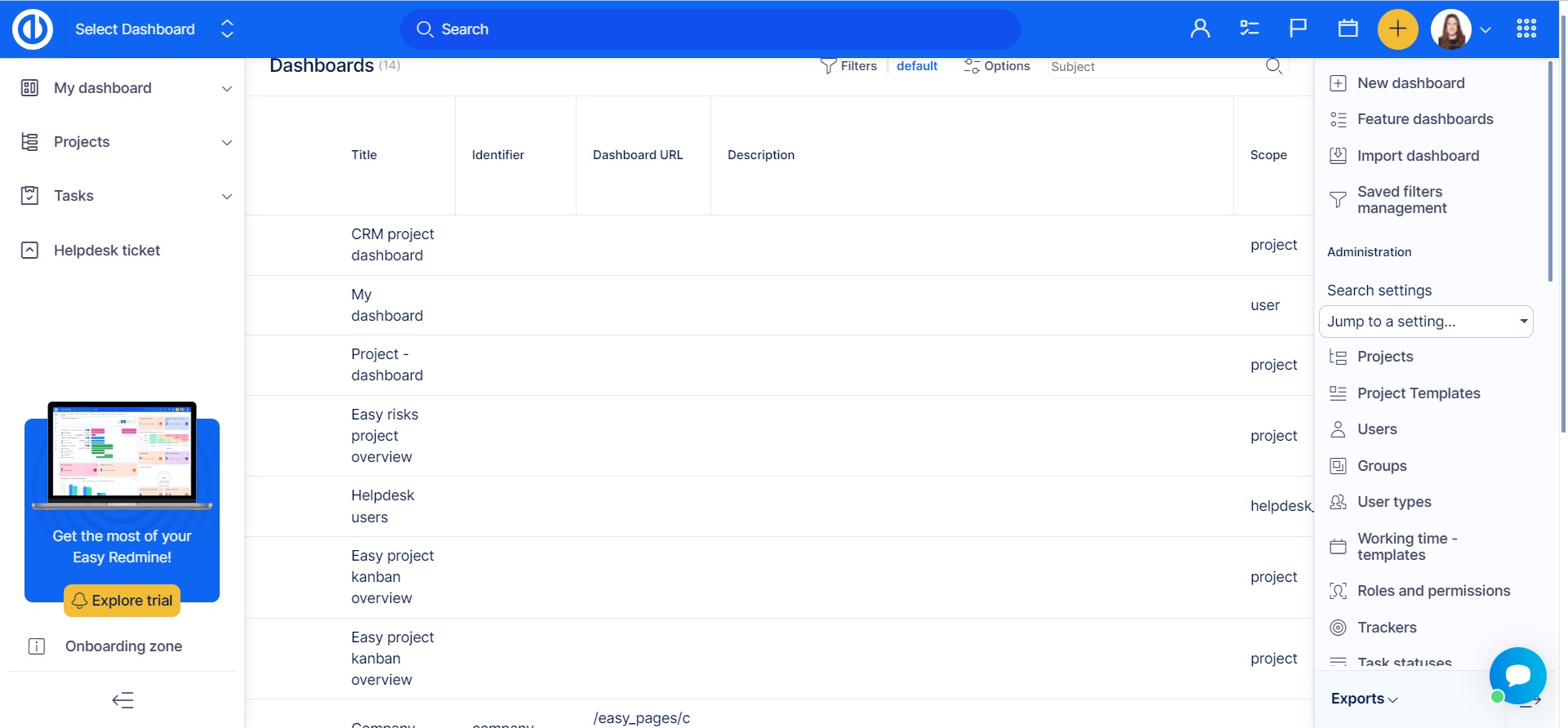
These default features (like B2B CRM, Service Desk, Risk Management, etc.) are easily accessible in the right-hand menu (in the new design at the top) and are pre-set and ready for use.
Use case: The built-in features may be used to streamline your customer relations management. The B2B CRM dashboard is used to track leads, customer interactions, and sales pipeline, while the Service Desk dashboard helps to monitor and manage customer service tickets, improving the efficiency of their customer service team and increasing customer satisfaction.
Global filters and Click through charts
Global filters above dashboards – all modules on dashboard are filtered together
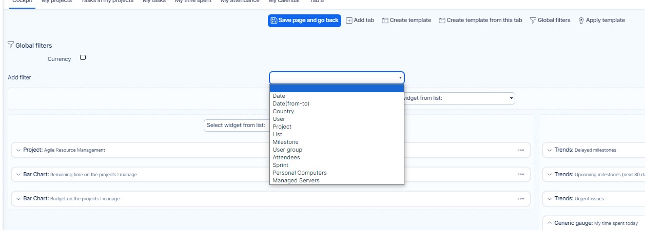
Global filters differ from conventional filters by allowing you to apply them to all or just selected modules together on any customisable dashboard in two clicks only. For example, when you apply global filter "last month", all modules on a customised dashboard will show data for the last month only without the necessity to change filters for each module separately. To create one, just click on the "Customise" in the lower left corner of the page and then navigate to "Global filters" in the top menu.
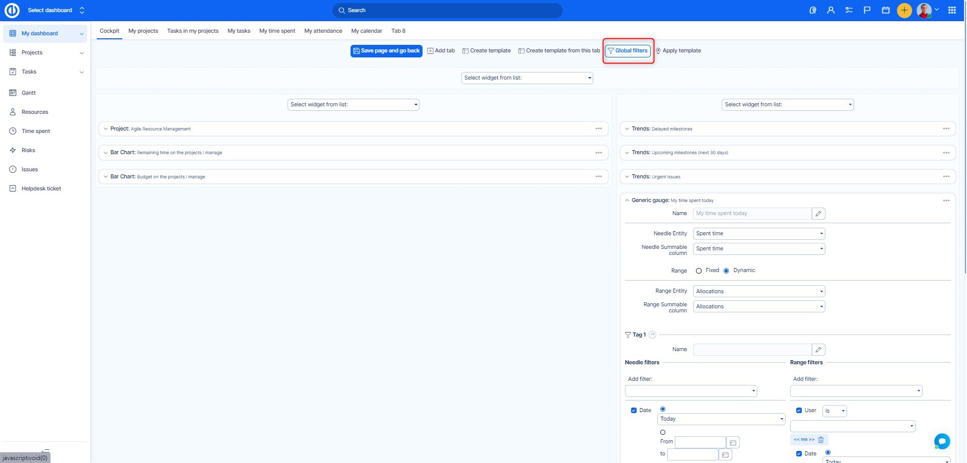
You can filter by the following criteria: Date, Date (from-to), Country, User, Project, List, Milestone, User group, Attendees, Sprint, And you will also find Assets from the Assets and Configuration management plugin (For example Computers, Servers)
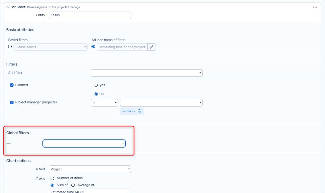
In order to select which of the dashboard modules are dependent on global filters and which are not, you need to pair global filters with those modules where you want to use them. To do so, go to module settings and navigate to Global filters section. Here you just need to check the filters you want to use with that module. Please note that only those global filters that can be used with the particular module are available to select.
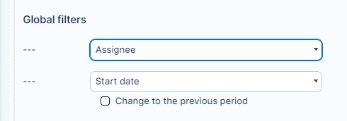
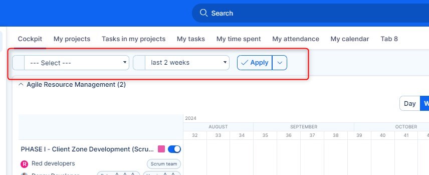
When global filters are configured, save the settings and now you can find your filters on the top of the page as drop-down menus. By applying a global filter, only filtered data shows in all paired modules together.
Graphs and charts with On-click
Any kind of graphs and charts added to a personalised dashboard can be configured to show a specific page (so-called "dimension") when a user clicks on the chart values. This page is displayed based on manually entered URL address, which can be found in the module configuration under "On click" section. In the "URL" field, enter the address of the page to show on click. If the URL address is located on the same domain, you may enter it without domain name such as "/projects" instead of "www.domain.name/projects".
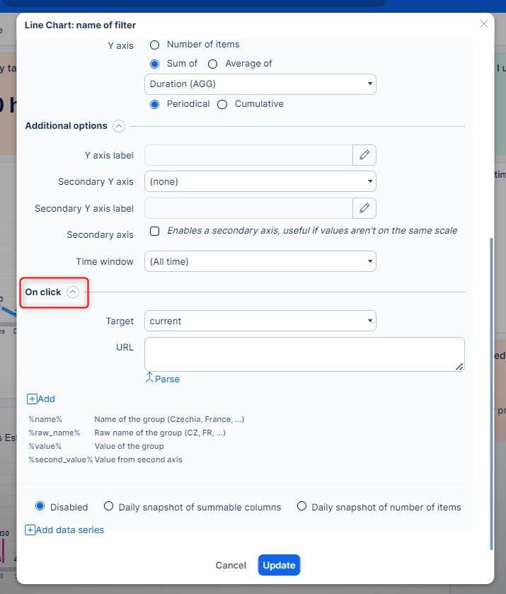
Example:
- Create a Graph
Set the filter and graph options. In this example, we configure the filter and options as shown below: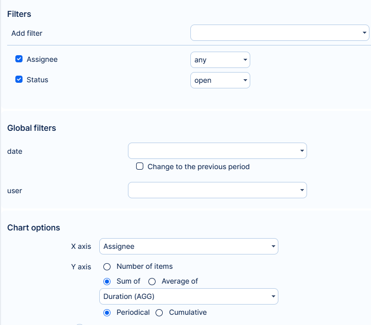
- Activate On-click Functionality
To activate the on-click functionality properly, it is important to create the same filter in a new tab. This can be done manually, or you can follow these steps: - Save the graph.
- Click on the widget name to open the filter in a new tab:
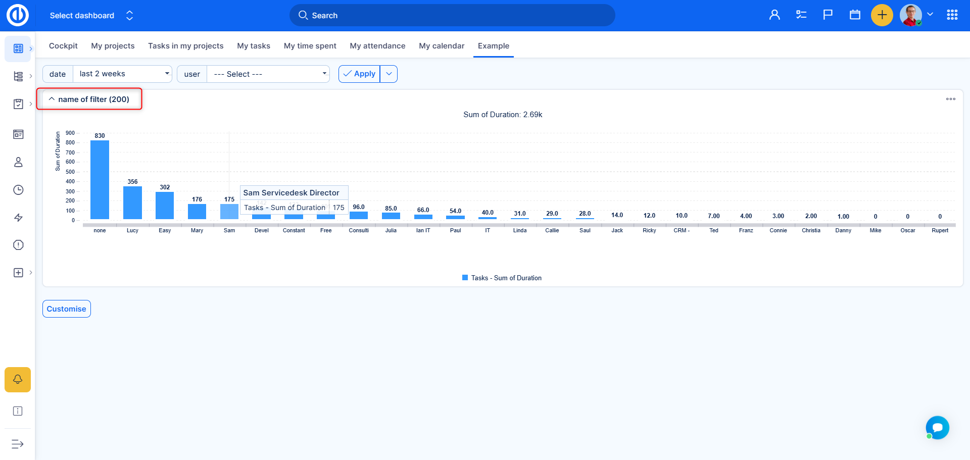
This will provide you with a URL containing the same filter. - Set Output Options
Next, open the options and ensure that only the "list" output is enabled. :
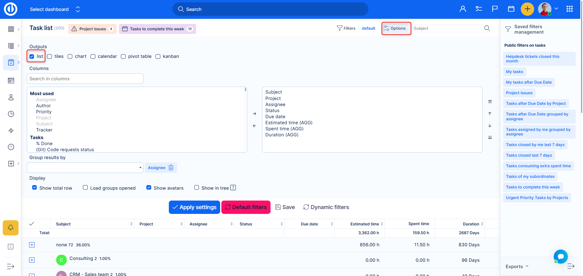
Apply the settings and copy the whole filter URL - Configure the Graph
Return to the graph you previously created and open its settings. Navigate to the On-click option:

- Edit Segment Selection
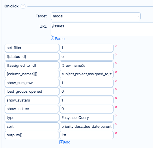
Edit thevaluekey for segment selection. In our case, it isf[assigned_to_id]. Change the value to%raw_name%. Additionally, add the column names (comma-separated) into one multiple-value field:
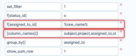
Additional you are able to edit all the parsed filters and options, or remove them. (For example Show_sum_row 1=yes, 0=no ). In the following image is what we ended up with in regards to settings :
- Select a Target
You will find three options:
- Current: Clicking will open the filter in the current tab.
- Blank: Clicking will open the filter in a new tab.
- Modal: Clicking will open the filter in a Quick View.
- Final Result
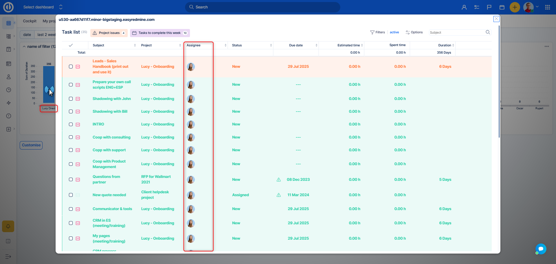
The result will look like this: A bar chart representing tasks per assignee. By clicking a bar that represents a specific user, a Quick View will appear showing only that person's tasks within the applied filter.
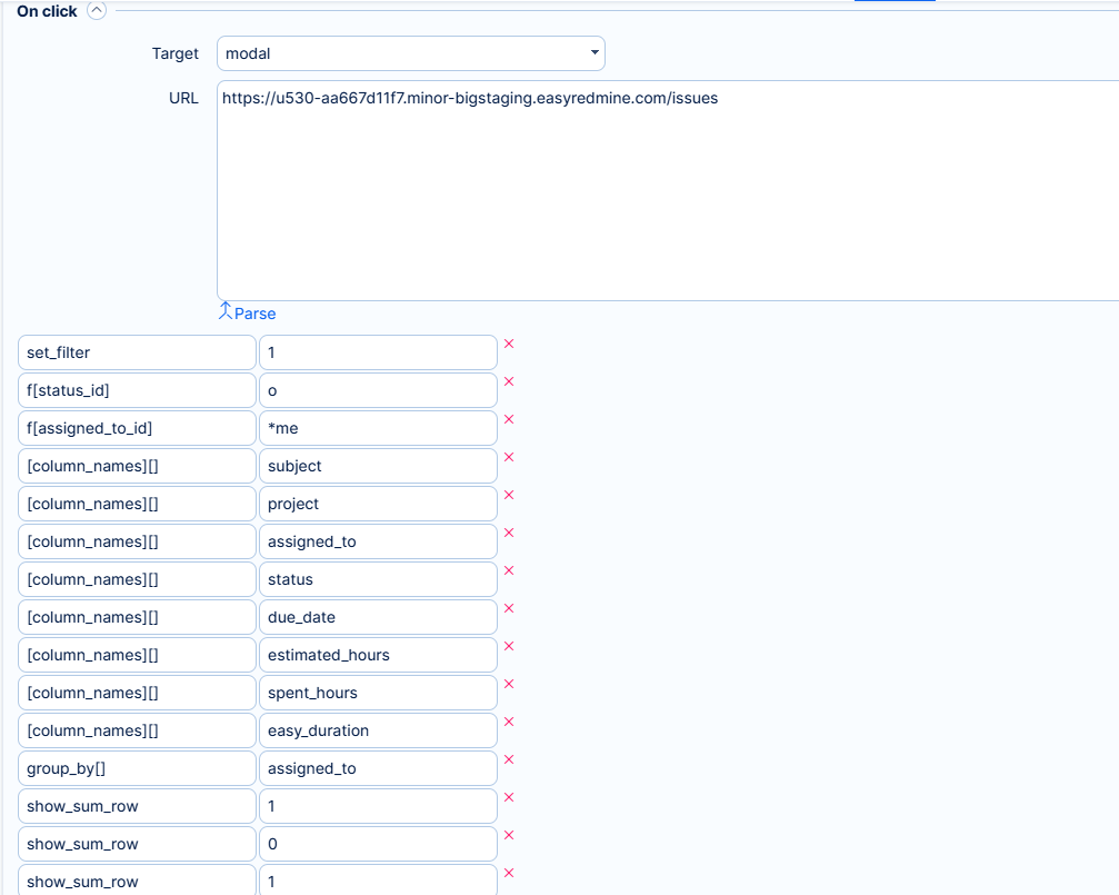
Paste the URL into the URL field. The data from the filter will be automatically parsed. You should see the following:
- When global filters Date and Date (from-to) are both created and applied on the same tab, the Date filter prevails over Date (from-to). Therefore, it is recommended to create Date (from-to) global filter on a separate tab to prevent the conflict.
- After editing a template, it must be applied again to the particular user in order to make the change appear (it will not appear automatically).
- iframe - You are able to use internal links within your application (for example to Gantt, or a Dynamic filter). However, quick task editor cannot be opened in the iframe.
