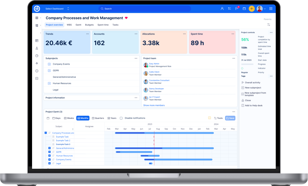
Release notes for version: 10.5.x
Please read before upgrading to platform version 10.5.
Recommended Ruby version: 2.6
Gantt improvements
The main PM tool in the application has received a significant facelift.
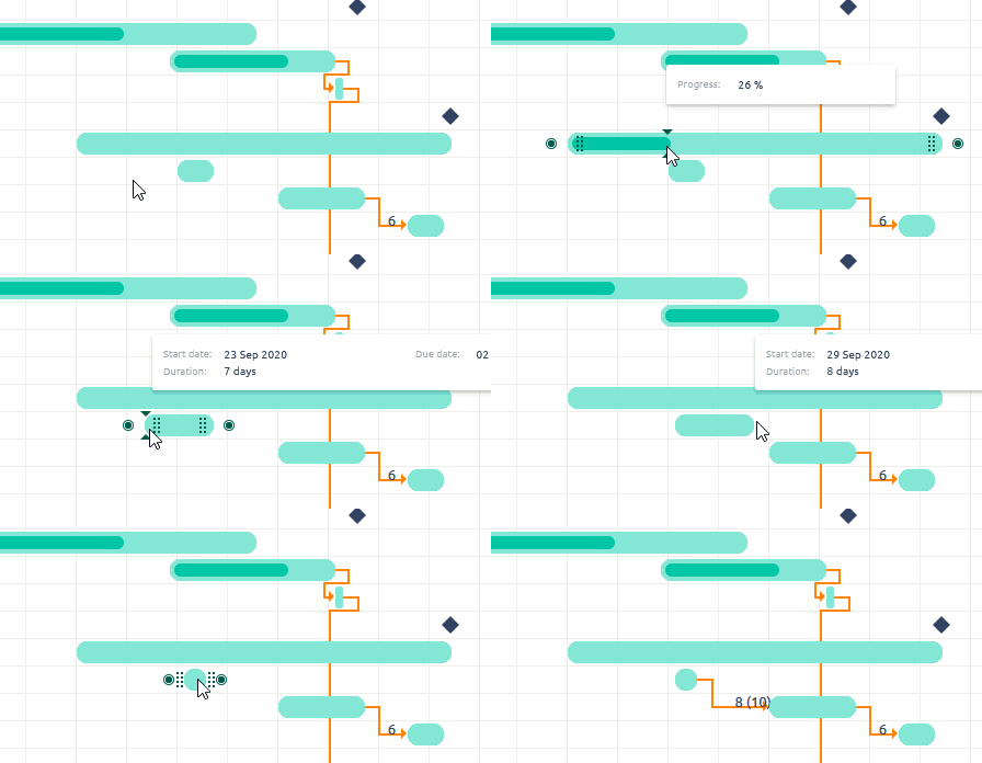
Easier catch and rounded corners
It is easier to catch the operational elements, such as start, due date; progress or relation creation. Even in the shorter tasks, you will better be able to catch the element you need to do your changes. We have also rounded edges to better separate tasks from each other especially when they have similar duration.
Tasks with missing start/due date
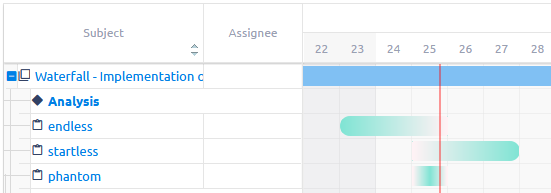
It is quite common situation that users create tasks manually with missing start or due date. Now, in Gantt you will notice these tasks at the first sight. Naturally, when you drag them in Gantt, both dates will then be set accordingly.
Unified tools menu and new legend
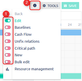
Previously the menu was heterogenic, with some buttons using icons, others had toggler. The buttons are unified with togglers. With the exception of Resource management, which not just a switch, but its own view with different set of tools.
A legend was also added to the info button next to tools.
Softer grid and added navigation lines
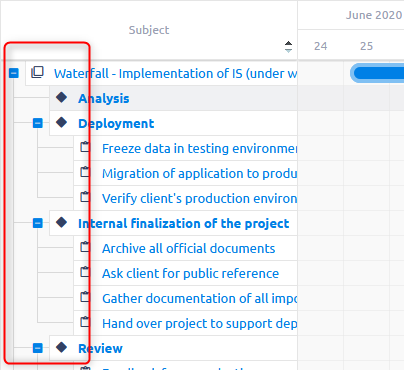
You may notice a less softer grid in the background of the chart. For project/task tree, we added navigation lines to help better trace the higher levels of each task.
Removed bulk expand/collapse of Project, Milestone, Parent tasks
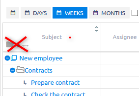
Unfortunately, having to balance between performance and ease of use, there was no way to ensure reliable functioning of the expand/collapse buttons that were previously above the project/task tree. The behaviour of these buttons was technically logical, but from user perspective unreliable.
The user's expectation, that on one click you could expand all data, becomes a major obstacle in larger projects, where there is simply too much data to be loaded at once in an graphical view with lots of functions. That is why rather than looking for middle ground that doesn't satisfy the server and neither the user, we decided to remove the buttons.
Scheduler improvements
We saved a bit space in the top bar. The listed users are in a more compact view. The setting button is available with new buttons on the right side. The new buttons are Users - when you want to add users to visible calendars; Full screen view

